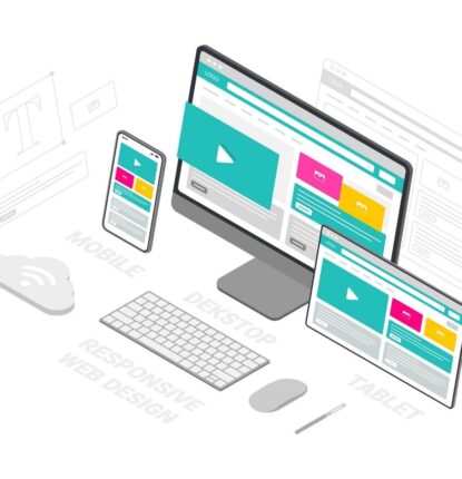
Franchise Website Design: When Form Meets Function

Enspire for Enterprise’s very own Michael Davis, project manager for all of our website builds, shared some of his valuable insights with me—and he never told me not to tell, so I am spilling the tea.
I asked him about his standards and best practices surrounding franchise website design. The following are direct quotes from Davis and some expanding thoughts from myself.
“From an end-user and user interface perspective, less is more.”
Website design is more than aesthetics. As with any tangible construction, form must meet function.
Imagine a shower. Think about all of the elements you believe your shower needs. Is it a walk-in, or does it have a bathtub attached? Is there a removable showerhead? What color are the grout and tile? Feel free to go wild and construct the shower of your dreams.
Now put all of the pieces together.
You step into your beautiful shower and when you go to turn it on, the process is simple, and the water comes out at just the right temperature.
Regardless of how detailed or minimal your design may be, showers don’t need to be complicated and neither do websites.
“A web page shouldn’t make users think about what to do. Avoid creating “choice overload” where there are so many interaction options that the user can’t decide what to do first.”
Remember your dream shower? This time, shift the scenario. Remember, looks can be deceiving. Imagine that the tiling looks flawless, but behind the walls not all of the pipes connect. What appears to be the faucet resembles a work of art, but you can’t figure out how to even turn it on. You finally manage to turn the water on, but it shoots out in all directions, and you can’t determine how to make it that perfect temperature. You end up confused and frustrated instead of clean and relaxed.
Your website should provide solutions and answers so your visitors want to continue to interact with it and want to take the next step.
“Basic accessibility practices can benefit all users: alternative text for images, descriptive link and button text, forms with visible and unambiguous field labels.”
Of course, I can keep this shower metaphor going regarding accessibility. Whether talking about showers or websites, it all boils down to creating a positive user experience. Make navigating the website easy and intuitive for everyone.
“Branding is important, but not as important as the content on the page.”
Take a look at your current shower system. Can you find the logo? Typically, it’s there, but it’s subtle. The look of the shower matters, but it means nothing if it doesn’t work.
You always want to convey a solid and cohesive brand identity on your website and across your franchise locations. A prominent logo and consistent color scheme make a difference, but they need the content to back them up.
Connect with Enspire for Enterprise to get showered with solutions (I couldn’t resist). We specialize in creating functional, visually stunning websites for franchises or multi-location businesses. Contact us to get started!
Your Mission Is Our Mission
Ready to scale your digital marketing for success?
We want to hear from you.
Contact us today for a complimentary, customized marketing consultation. Or, just to say hi :)
"*" indicates required fields


